You have browsed a site on your laptop and crackingly wondered, “Why does this website look so different on my phone?”
Welcome to the enchanting world of screen resolution!
Users are browsing websites by a motley collection of laptops, desktops, tablets, and mobile phones — is an array of screen resolution. Designers, developers, and digital marketers must grasp what are the common screen sizes, giving smooth user experiences, thereby keeping SEO intact.
This guide will discuss popular resolutions across devices, why they matter, and how to confidently design for them.

What Is Screen Resolution?
Before numbers get mentioned, the term screen resolution should be defined.
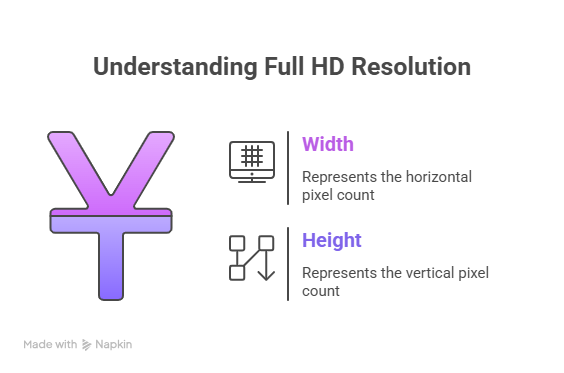
Screen resolution is measured in pixels-width × height.
For example:
1920×1080 → 1920 pixels in width, 1080 pixels in height (also referred to as a).

But the trick here is: resolution is never the same as screen size. Two laptops can be running one resolution of 1920×1080 while one has a 13-inch display and the other has a 17-inch display.
The resolution sizes matter more considering web design-they determine how much content fits onscreen and how layouts will adapt across devices.
The Most Common Screen Sizes
As technology grows ahead, the variety of screen sizes across devices continues to grow. Desktop monitors, laptop screens, and mobile devices are some of the few areas wherein knowing the most common resolutions will make the medium truly unified in visuals and access.
Desktop & Laptop Screens and Sizes
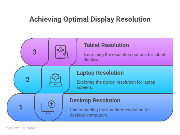
As far as desktop resolution is concerned, most users probably still go by the tried-and-true 1920×1080 (Full HD) resolution.
With time, there are so many options when it comes to screen size and resolution. A perfect experience should be available to every user, be it a designer working on 4K or a student on a budget laptop.
-
1920×1080 (Full HD) → It is still considered the most common desktop resolution and enjoys the largest share as far as global screen use is concerned. It is commonly accepted as the standard resolution among desktop and laptop users.
-
1366×768 → Still the default resolution for budget laptops, more so in the educational field or entry-level jobs.
-
1536×864 & 1440×900 → These are seen more in mid-range laptops, thus common in professional workplaces.
-
2560×1440 (QHD) → The “es”-word for designers and creators of content, with gamers competing for its sharper visuals.
-
3840×2160 (4K UHD) → It is picking its grounds up as the talk among high-end desktop users, especially for design and multimedia.
Pro Tip: Between 1366×768 and 1920×1080, test your sites or apps, as these resolutions are the most commonly used by laptop and desktop users.
Mobile Screen Resolutions
The article tends to give more attention to precise desktop size and laptop-screen sizes; in reality, the mobile traffic dominates the globe.
Among the most common mobile resolutions are the following:
- 360×800 px → Standard for many Android phones.
- 390×844 px → Common among iPhone 12, 13, and 14.
- 414×896 px → iPhone XR and iPhone 11 Pro Max.
- 412×915 px → Bigger Android gadgets.
Mobile screen resolutions are getting taller, heading toward 19:9 and 20:9 aspect ratios that make scrolling vertically more natural.
Tablet Display Sizes
Tablets seem to continue to fill up the gap between mobile and desktop. Here are the tablet display sizes that are more relevant for use:
- 768×1024 px → Regular iPad in portrait orientation.
- 1280×800 px → Common on Samsung Galaxy Tab devices.
- 820×1180 px → Seen on the newer iPad Air models.
- 800×1280 px → An Android tablet.
Pro Tip: Always test tablet mode in portrait and landscapes — they flip quite often!
Common Screen Resolutions for Web Designers
On common knowledge, if you want responsive professional websites, you must keep common resolutions in mind. Why is this so important?
Nowadays, websites are viewed from all sorts of devices: from cheap laptops to takers for view shot 4K monitors, and every resolution in between. As a designer to provide a uniform high-luxe experience to everyone, it is lost upon their customers to maintain responsive design conforming to screen resolution adjustments.
Optimizing for standard screen resolutions shows that it is all about the UX, standardization of a brand experience, and higher ranking on SEO. So, shall we look into why these three make a difference?
Standard Resolutions
These breakpoints help lay down an effective responsive CSS rule to adapt your design to various screen sizes.
- Mobile: 360px, 390px
- Tablet: 768px, 1280px
- Laptop/Desktop: 1366px, 1920px, 2560px
Pro Tip: These breakpoints encompass the most common screen sizes to ensure your design goes along well with most devices.
Best Practices For Designing
Designing for various desktop and laptop screen sizes, as well as mobiles, can be a daunting task, and the following best practices can make things easier for you:
- Start mobile-first → Design for the smallest screen first and scale up. This ensures you create the best mobile experience before moving on to larger screens.
- Use fluid layouts → Using a flexible grid such as Flexbox and CSS Grid will allow your contents to adjust themselves gracefully.
- Optimize images → Responsive image formats like WebP decrease loading times.
- Test across devices → While emulators certainly help in testing, using actual devices for testing being one hundred per cent sure that your design works across all screen resolutions. Screen resolution also matters when using remote access software, mismatched resolutions between local and remote machines are one of the most common sources of display problems. If you’re experiencing resolution issues specifically in Splashtop, see the Splashtop display issues troubleshooting guide for fixes.
Pro Tip: Cover the top 5 common screen resolutions. The approach has the advantage of covering most of your website users and saving you from making your design unnecessarily complex.
Conclusion: The Future of Screen Resolutions
With new technologies opening up new avenues, screen resolutions are going through a metamorphosis. The advent of 4K and ultra-wide monitors, foldable devices, and higher refresh rates is fundamentally changing our interaction with digital content. These future-oriented trends not only concern web designers but touch all aspects of tech, from gaming to multimedia to mobile devices.
Designing with future resolutions in mind would take us a step ahead and would include a responsive layout and consistency across all devices. Embracing these changes ensures websites and applications will remain innovative and user-friendly as display technologies become widely accepted.
By investing now to prepare for the future, we ensure a seamless user experience across all devices, whether today or tomorrow.


